 (1)")
How Colors Influence Perception, Emotion, and Brand Identity
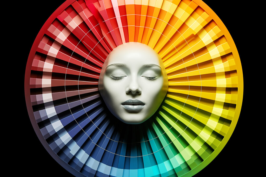
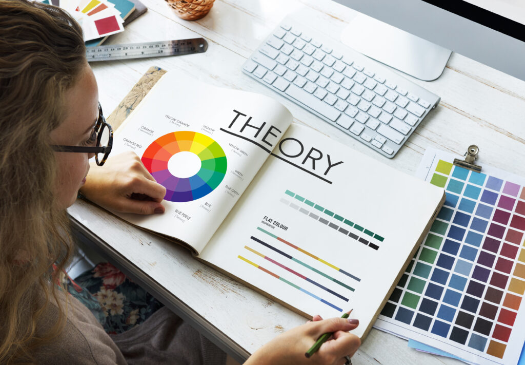
Color isn’t just decoration, it’s communication. Behind every successful brand lies a smart use of color psychology, the science of how colors influence human behavior, perception, and decision-making. From trust-building blues to energetic reds, colors speak to your audience before you ever say a word.
1. Colors Create First Impressions in 90 Seconds
Studies show that up to 90% of a customer’s first impression is based on color alone. That means your logo, website, packaging, or even social media feed is silently doing the talking. Are your colors saying what you want them to?
- Blue = Trust, reliability (often used by banks and tech companies)
- Red = Energy, urgency (used in sales and food industries)
- Green = Health, growth, sustainability (popular in wellness and eco brands)
EverUp tip: Choose colors that align not just with your product, but with the emotion you want to trigger.
2. Colors Influence Consumer Behavior
Color affects how people feel and act. For example, red has been shown to increase heart rate and stimulate appetite, it’s no surprise fast food giants love it. Meanwhile, calm tones like soft blues and neutrals build trust and loyalty.
If you’re in e-commerce, even the color of your CTA buttons can impact conversions.
3. Cultural Context Matters
The meaning of color changes across cultures. White represents purity in the West, but mourning in parts of Asia. Red is lucky in China, but can signal danger elsewhere. If your brand speaks to a global audience, this is crucial.
EverUp tip: Always consider your target market’s cultural lens when choosing your palette.
4. Consistency Builds Recognitio
Big brands don’t just pick a color, they own it. Think of Coca-Cola red, Tiffany blue, or McDonald’s yellow. These choices are consistent across every touchpoint, making them instantly recognizable.
Your colors should be used consistently in all brand materials, from your website to your invoices.
5. Color Can Subtly Shift Brand Positioning
Want to look more premium? Use black, gold, or deep navy tones. Targeting eco-conscious consumers? Go with earthy greens and beiges. Want to appear bold and youthful? Bright contrasts and neon accents speak volumes.
Your visual identity should match the psychological position you want in your customer’s mind.
The Takeaway: Color Isn’t Just Visual, It’s Strategic
Color psychology is one of the most powerful (and underrated) tools in branding. It goes beyond “what looks nice”, it’s about what feels right to your customer. Whether you’re launching a new brand or refreshing an old one, the right color strategy can instantly elevate your message.
Need Help Choosing the Right Colors for Your Brand?
At EverUp, we don’t guess, we design with purpose. Our branding experts combine psychology, design, and strategy to craft visual identities that speak to the right audience and drive real business results.
Ready to make your brand unforgettable?
Contact us: +355 69 700 3208
Email: marketing@everup.al